Increase engagement and boost habit-formation for puzzles
PUZZLES & GAMES
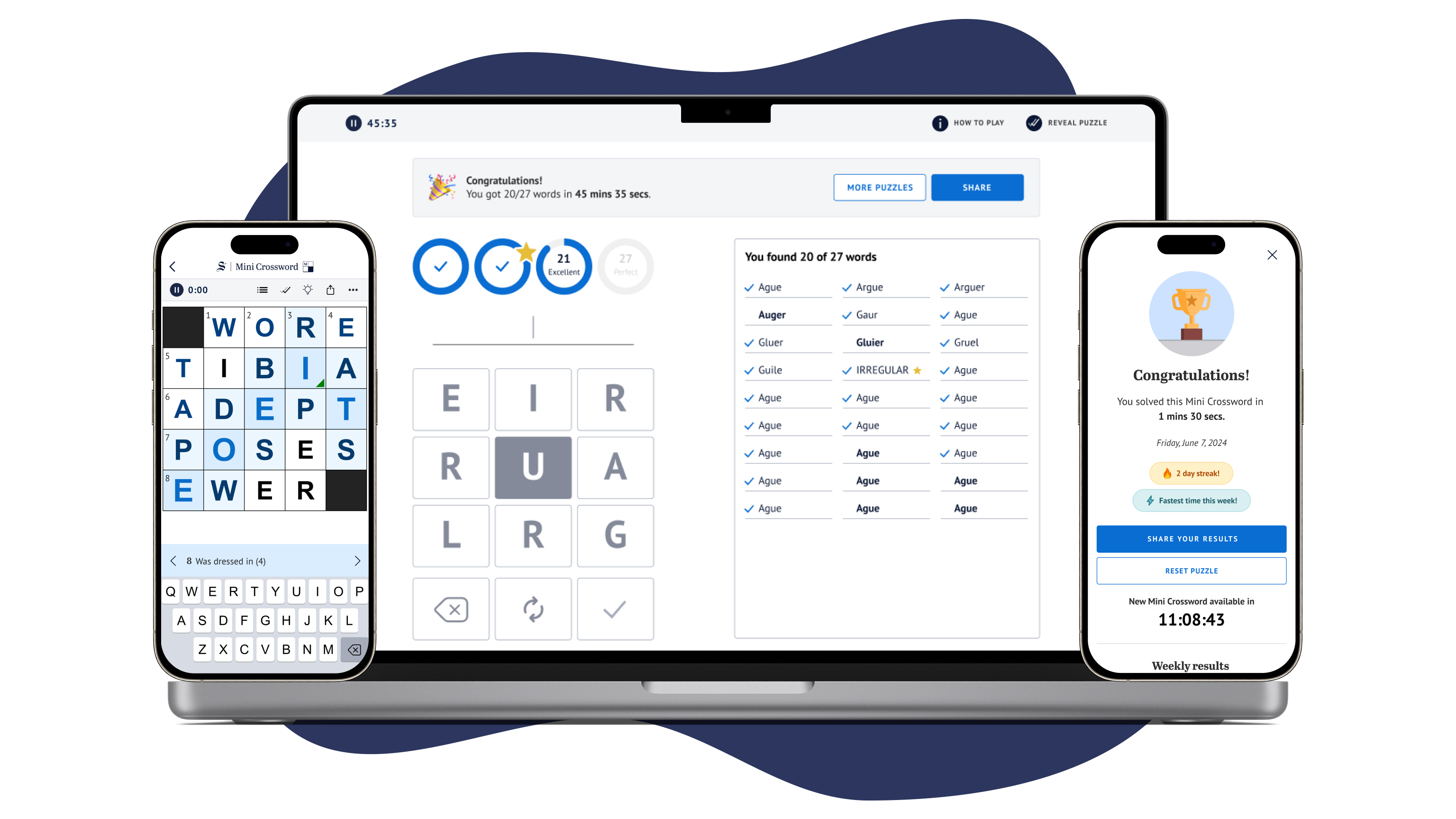

On The Sydney Morning Herald and The Age (two Australian newspapers), puzzles are among the most highly valued features for subscribers. Data shows that puzzle players are the least likely to churn, and grow subscriptions at a higher rate than any other content.
However, since the digital puzzles platform's launch in 2020, it has seen little improvement. As publishing competitors continue to enhance their offerings, there was a growing need to evolve our puzzles experience to better engage existing users and attract new subscribers
“How might we increase engagement and boost habit-formation of the metro masthead audience to acquire new subscribers and reduce subscriber churn?”
“How might we increase engagement, improve retention and reach new markets by enhancing the metro masthead puzzles, games and quizzes offering?”
To design a more engaging and habit-forming puzzle experience, we began the discovery phase with extensive user research which sought to understand;
The wants and expectations of puzzles users both for current offerings as well as new
Insights that will help inform user personas and create a summary of the pain points of current puzzles offerings as well as insights into what new puzzles & features users want
What prompts users to add playing puzzles to their daily habits and further understand what keeps them returning regularly
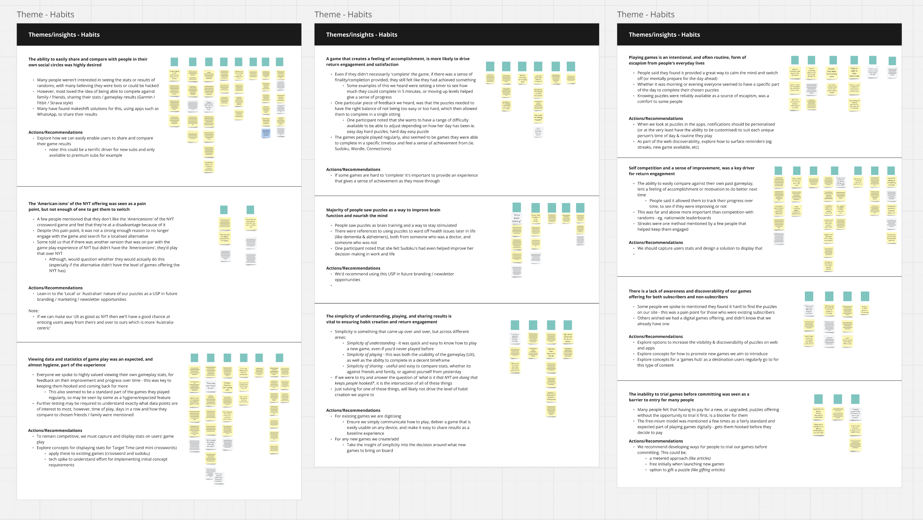
Puzzles research synthesis
Our research revealed several key insights which helped to form two key user archetypes, each with distinct behaviors and motivations:
The "On-the-Go Puzzler" - Plays as part of a daily routine or as a mental reset during a busy schedule.
The "Free-Time Puzzler" - Engages more deeply during moments of situational free time, seeking relaxation and connection.
Importantly, users can shift between these two modes. They might be an "On-the-Go Puzzler" during the workweek but switch to a "Free-Time Puzzler" on weekends. This flexibility meant that we needed to create an experience that appealed to both archetypes, ensuring that users could enjoy our puzzles suite no matter what situation they were in.
The insights and archetypes provided a clear baseline for our future puzzle experience. The first major step was translating one of our most popular print puzzles, Target Time, into a digital format.
In our print edition, Target Time is a nine-letter-word puzzle where players are tasked to create as many words as possible. The goal is to reach the predefined goals, ‘Average’, ‘Good’, and ‘Excellent’. Target Time in particular was a very different style of game than one of the ones that we had currently had on offer.
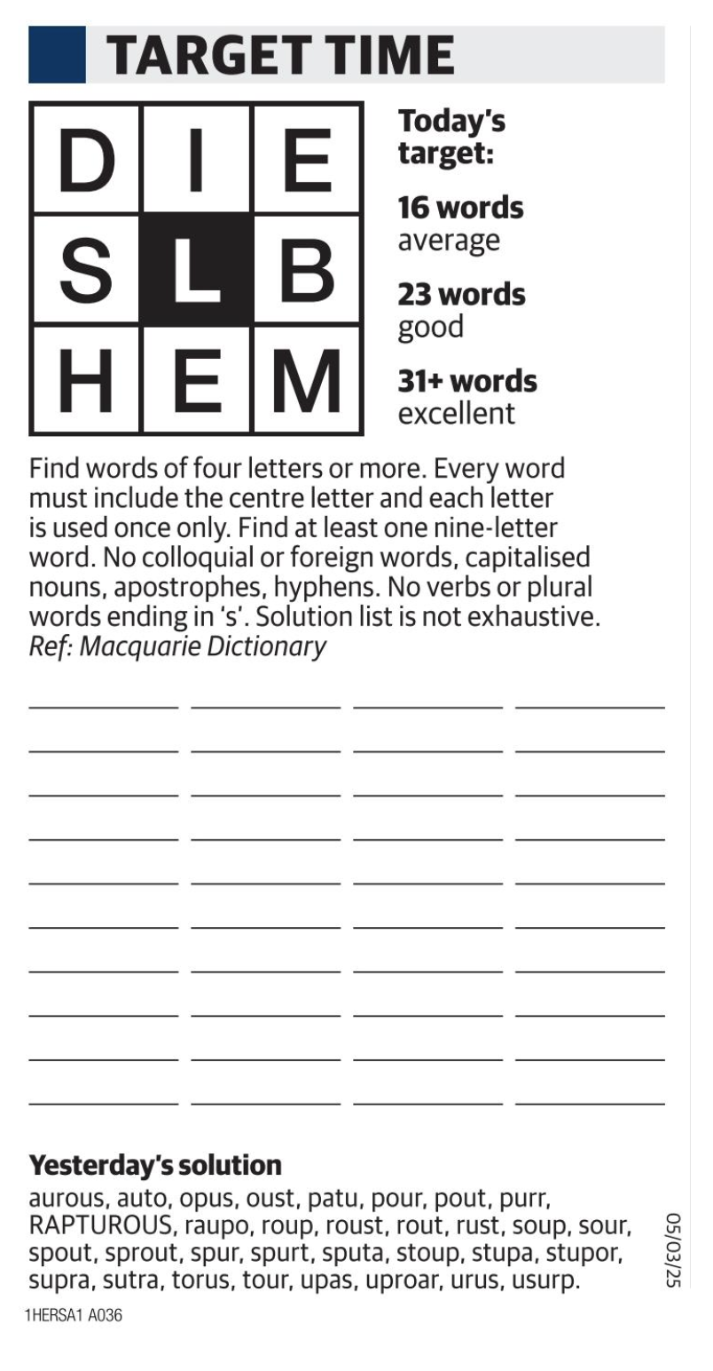
Target Time in our print edition
Therefore, there were some challenges that we had to overcome with the translation from print to digital.
Balancing difficulty with encouragement - Target Time is inherently challenging, with completing the full word list being nearly impossible. How can we motivate players, and create a sense of achievement even if they don’t find every word?
Game completion - In print, Target Time has no completion state. How can we introduce a clear endpoint in the digital experience?
Score representation - How can we visually represent the user’s score in a way that feels rewarding?
Correct word tracking - On smaller screens, where is the best placement for already-entered words so users can keep track of what they’ve already entered?
Streaks - What rules do we want to set for streaks and how do we present it to users so that it keeps them wanting to come back?
We started the design process with an extensive competitor analysis. We examined best practices in puzzles and games across both publishing industry leaders and the broader gaming landscape. This audit provided valuable insights into UI patterns and engagement strategies (such as success state animations) that informed our approach.
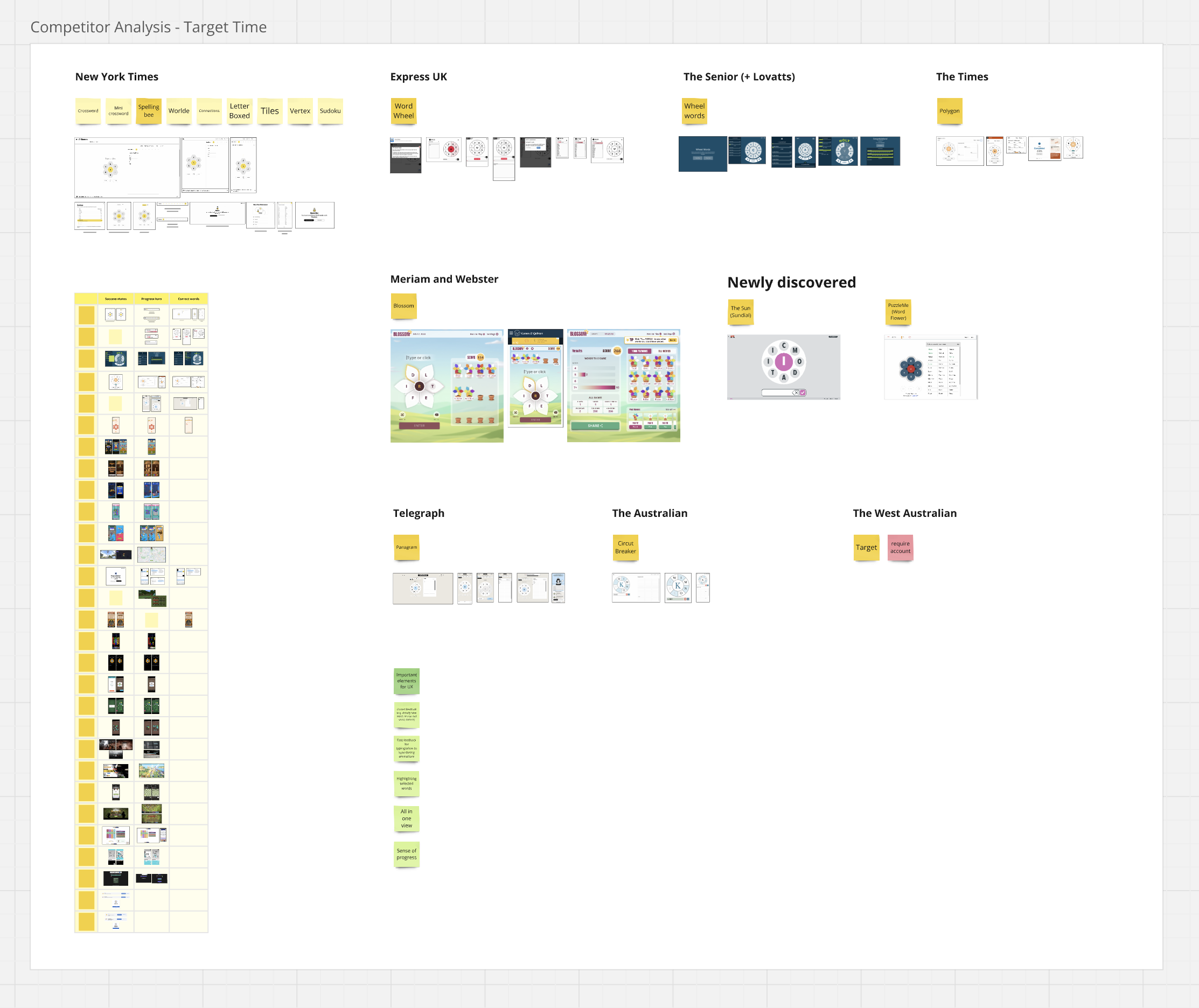
Competitor analysis findings in Miro
We tackled Target Time on an element by element basis, with many rounds of iteration, thinking, and design critiques. To adhere to our challenges, we implemented:
Several animations for success states, such as goal completion.
A brand new ‘Perfect’ target which contains every correct word and provides a definitive game completion state for users.
A progress bar visualised as ‘rings’ which kept users engaged and hunting to complete each goal.
On smaller breakpoints, a dropdown which contained the user's score and most recently entered words.
The tracking of a user’s ‘Streak’, with plans to visualise them for our next update.
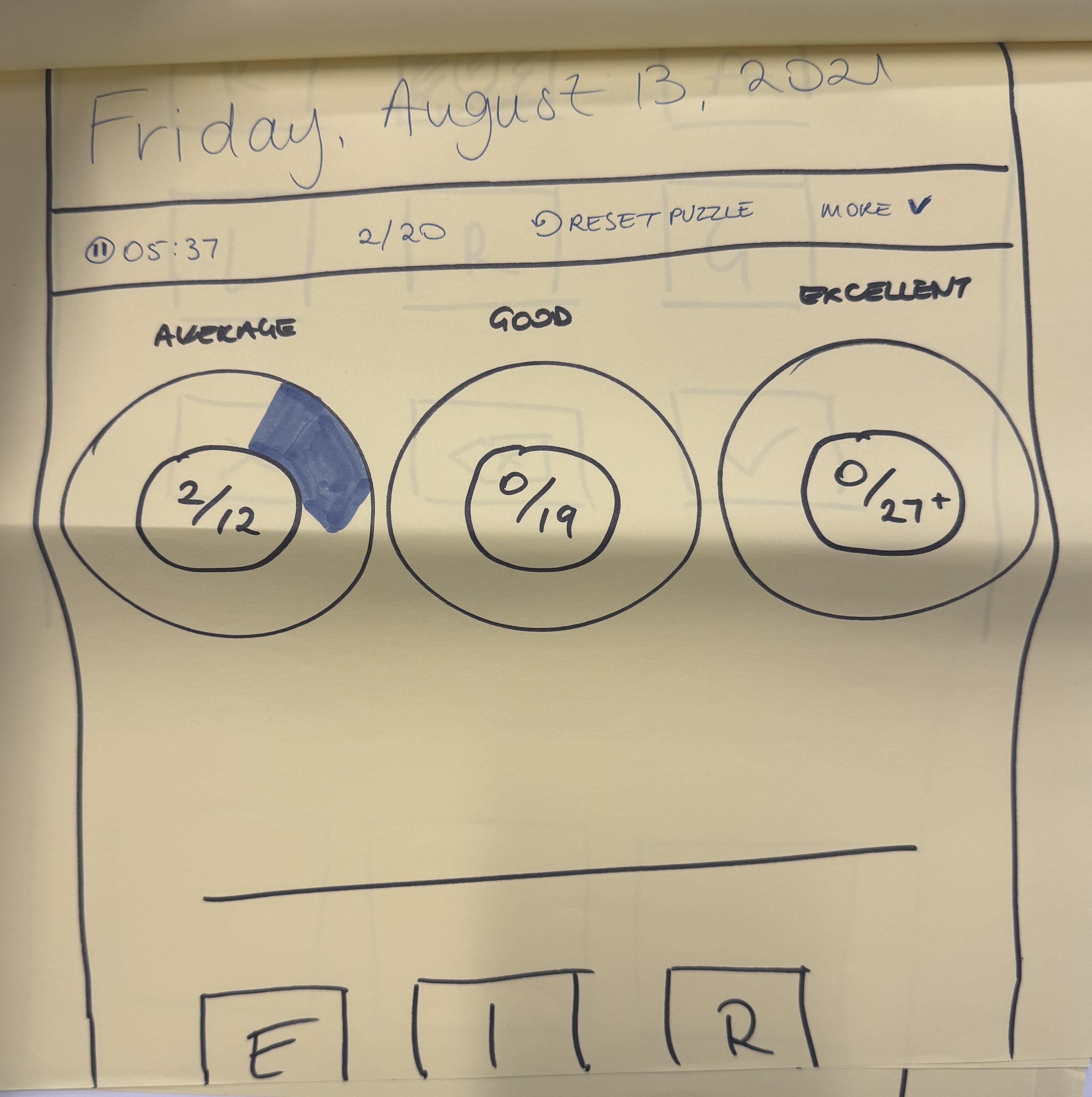
Early sketches of 'Rings'
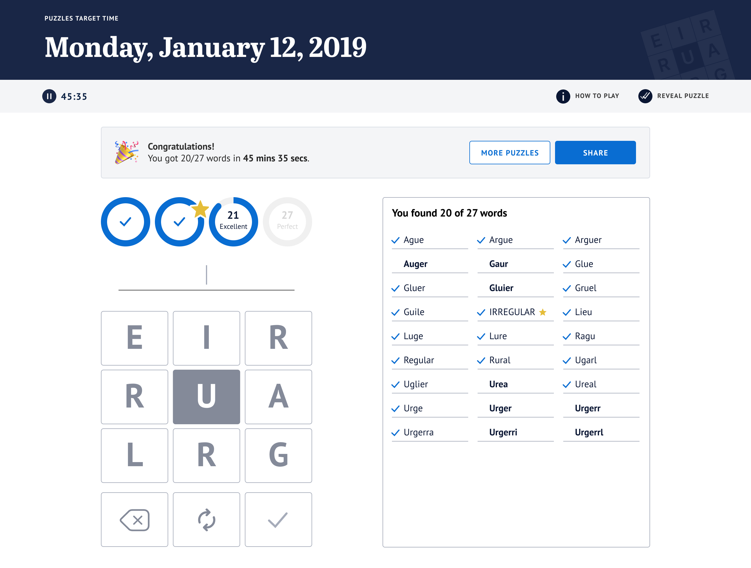
Target Time game completion design
After two months of dedicated design work, Target Time moved into development. It launched to subscribers on June 26, 2024, and was met with overwhelming enthusiasm.
Some user feedback:
"Long-time Age subscriber and Target player. I've often wished for an online interactive version—finally, it's here! Thank you. I love it!"
"I am loving the interactive Target Time! Thank you so much!"
However, some feedback highlighted a discoverability issue within our apps. Since the puzzle was web-only, we lacked a clear entry point for our app based puzzle audience. After the apps team implemented in-app authentication we launched an app entry point in January 2025, increasing daily users by 50%.
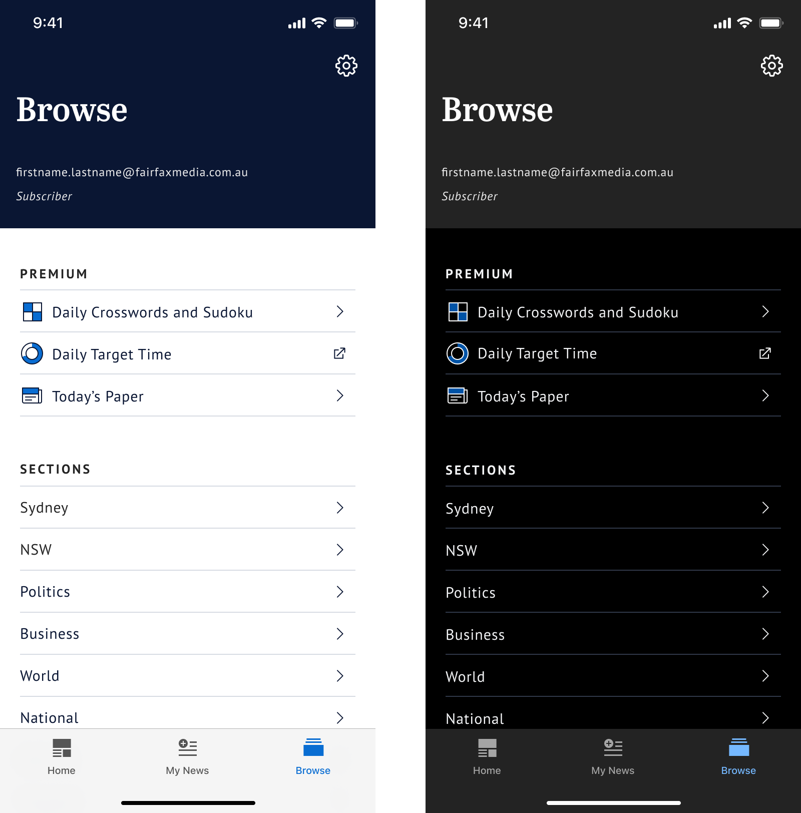
In-app entry point
Building on the success of Target Time, we focused on a brand-new, digitally exclusive puzzle: The Mini Crossword. Prior to starting design, we decided as a team that the most important elements were;
Speed matters - The speed at which users is the primary factor for scoring.
Social sharing is key - Being able to share your time and compete with friends is an expected feature.
Fixed-viewport experience - Given the emphasis on speed, it’s essential for the user to have all of the information and tools accessible within a single view.
Fun and engaging - UI elements should make the experience feel dynamic and rewarding.
Our puzzles suite already featured two crosswords, but for the Mini Crossword, we wanted to introduce a fresh design that felt fast, fun and engaging. Before starting design work, we began with a competitor analysis, focused on crossword interfaces. This research was vital to identify best practices and to understand the features users would expect from a digital crossword experience.
To make gameplay more dynamic, we incorporated a series of animations. Subtle animations, like on the correct and incorrect letters, provided real-time feedback. Whereas bigger celebratory animations, like at game completion, gave users a sense of accomplishment.
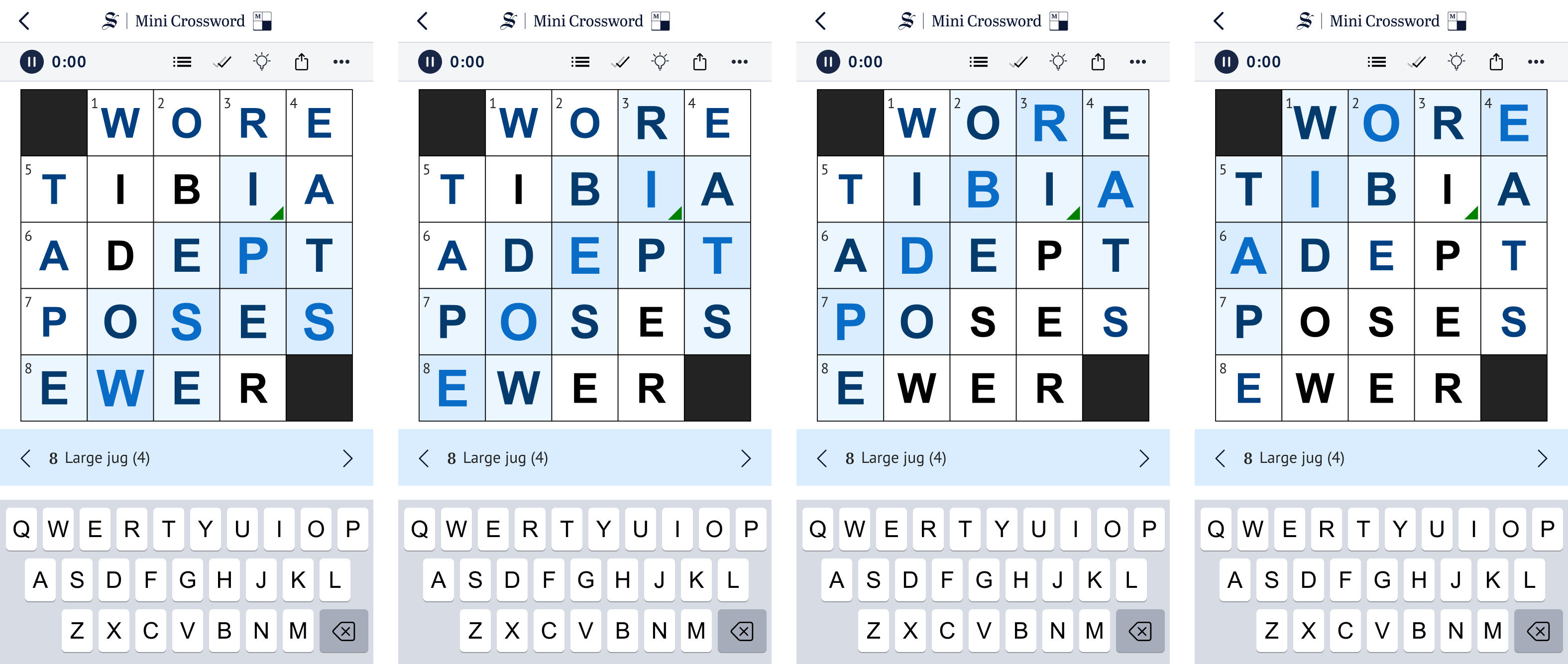
Prototype of game completion animation
We also introduced user stats, giving players a weekly performance recap, a visual streak tracker, and a badge for their fastest solve time of the week. This gave users an element of self-competition, encouraging continued engagement.
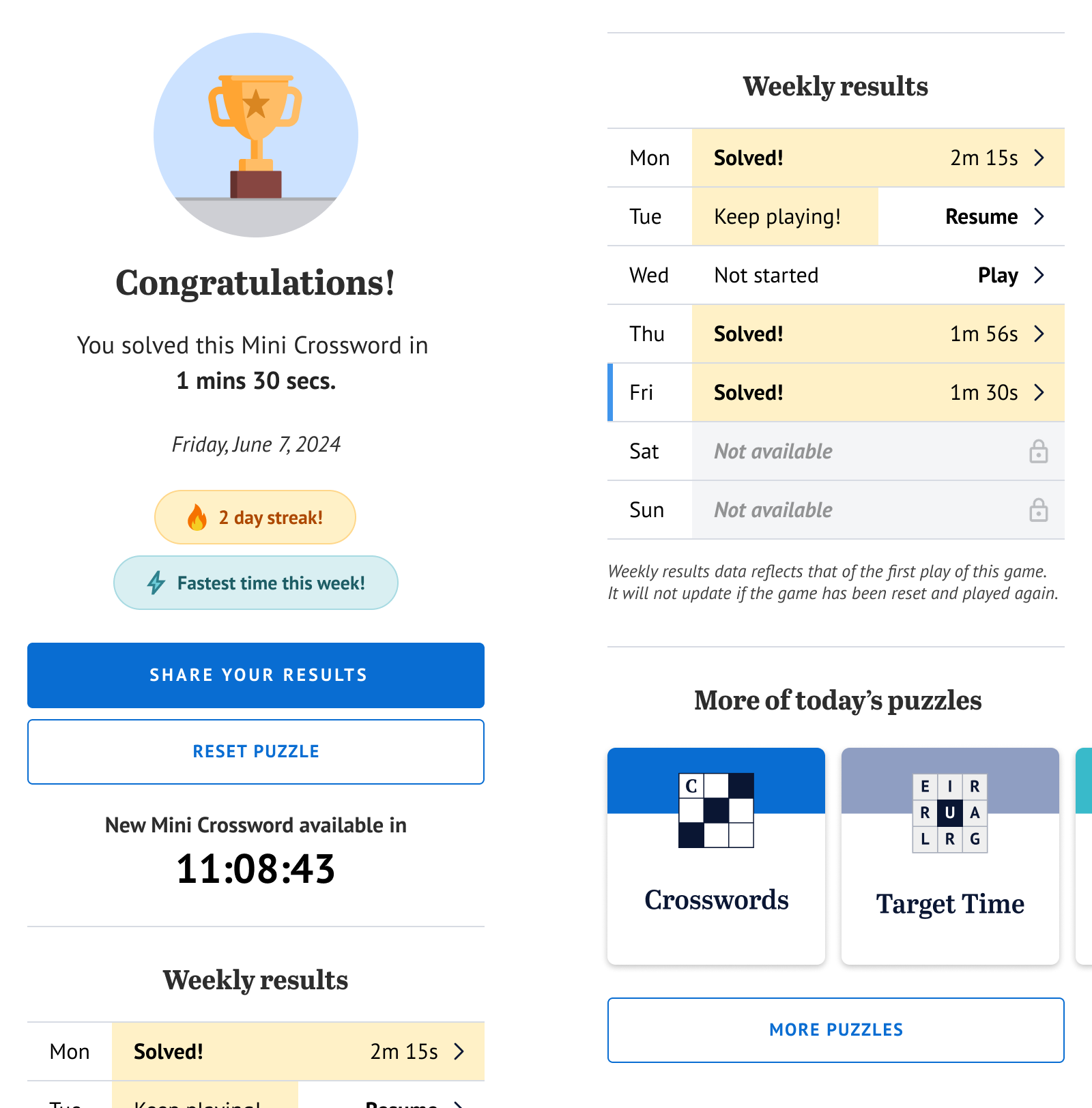
Statistics page
Finally, one of the most impactful design choices of this puzzle was the fixed-viewport layout. By eliminating the need for scrolling or switching views, we optimised both solving speed and overall user experience.
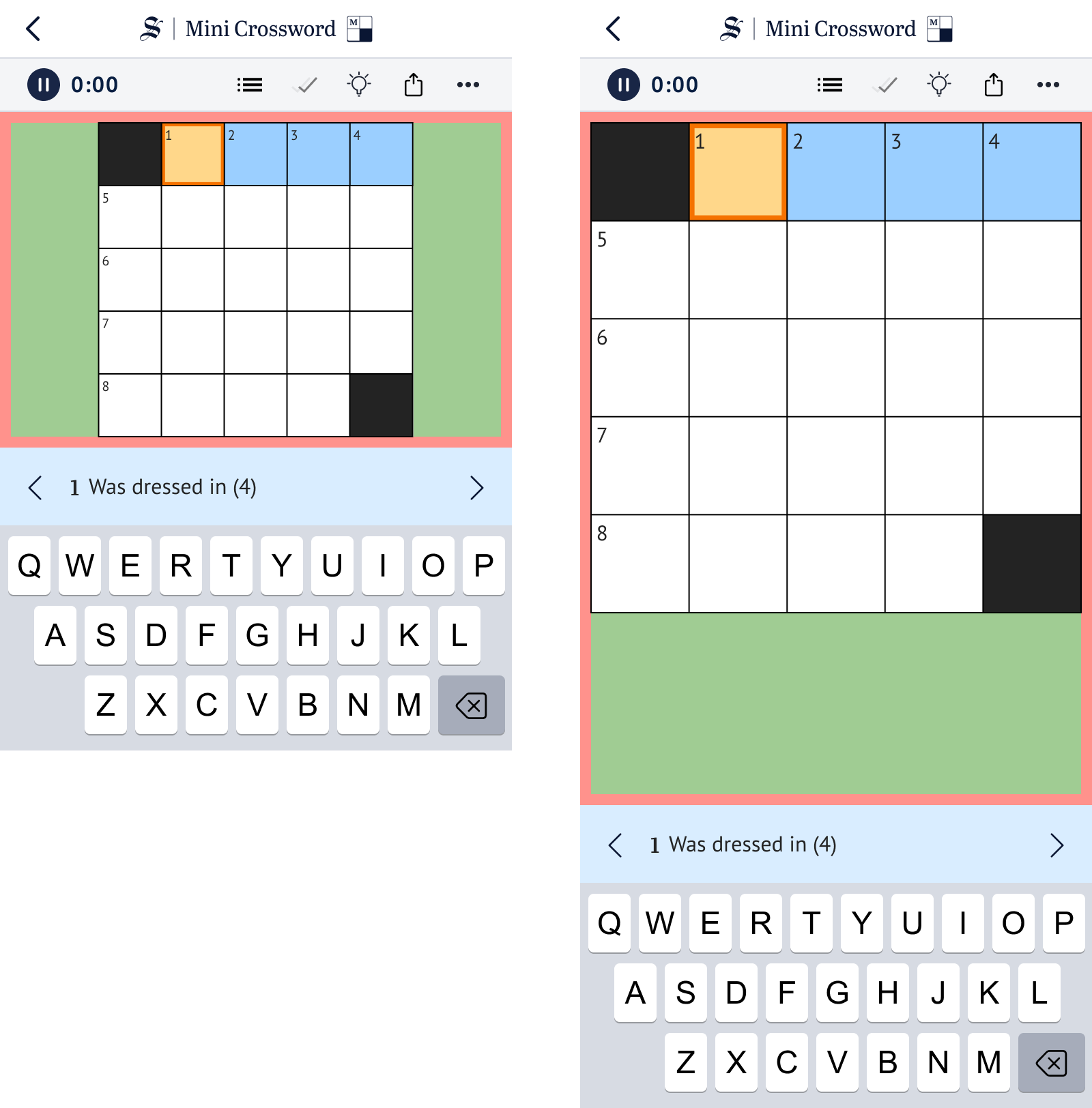
Fixed viewport exploration
Importantly, this fixed-viewport experience was designed to be future-proof. It creates a reusable framework that can be applied to several other games that we offer in our print edition as well as our existing crosswords and sudokus.
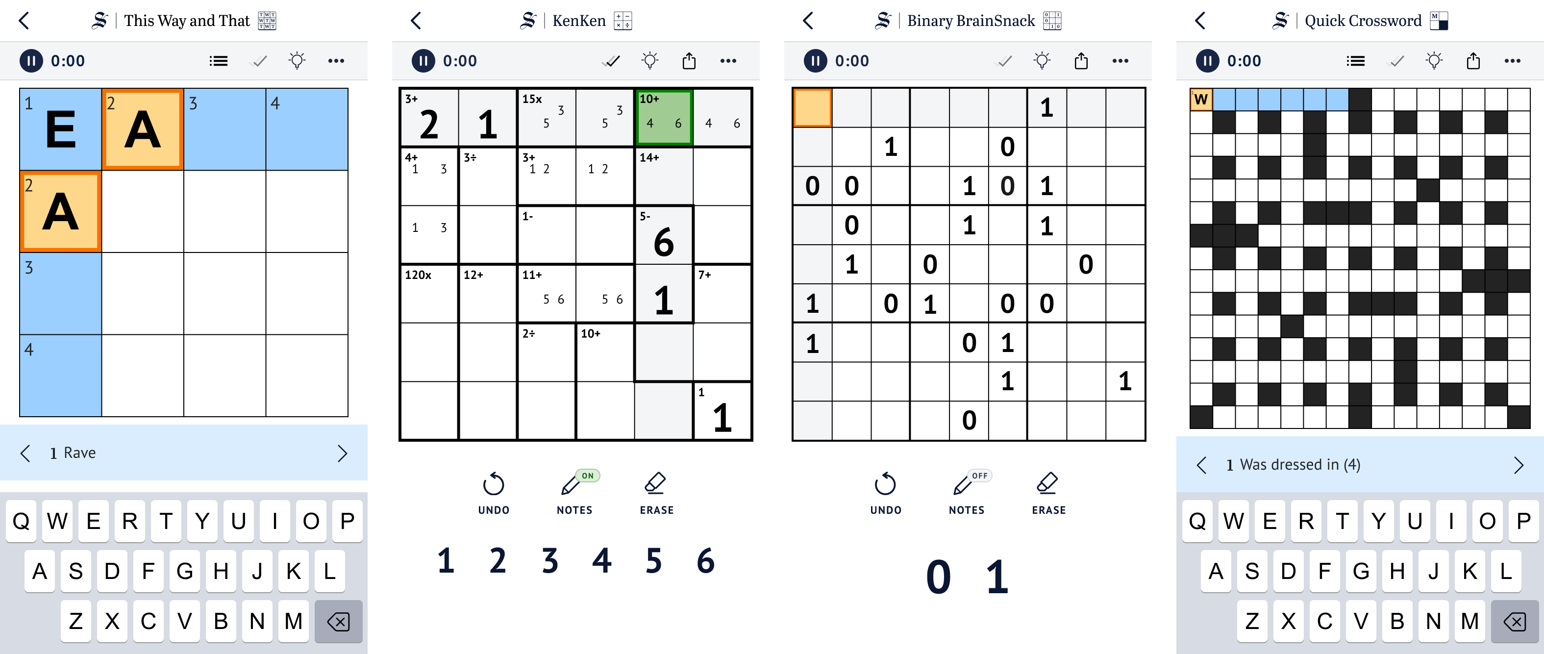
Explorations for future and existing games
The Mini Crosswords is currently being developed and is expected to be our most successful puzzle yet, launching in March 2025.