Salesforce ecommerce website design and development
AFDIGITAL REDESIGN
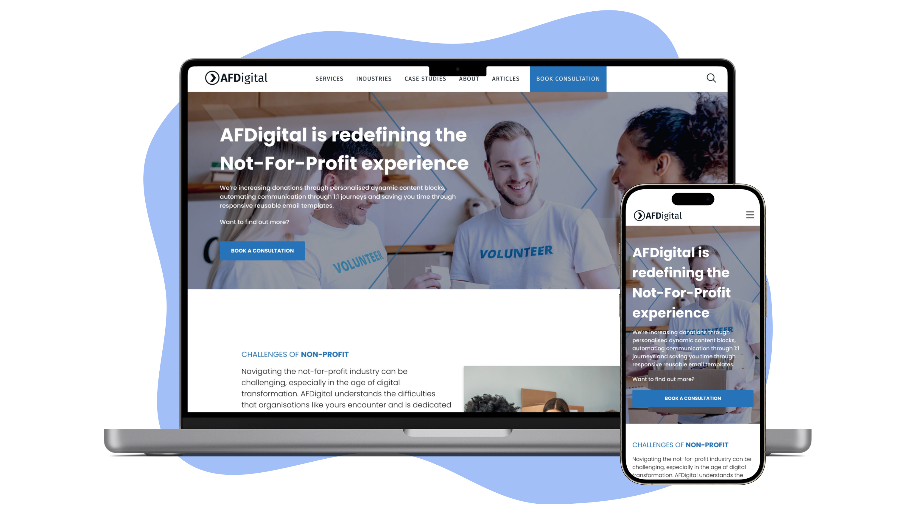

Our goal was to revamp an existing website built on Salesforce to create a more modern, visually engaging, and user-friendly experience. Beyond improving usability, we aimed to position the company as an industry leader by showcasing our key offerings more effectively and attracting clients across targeted industries.
I led this project, collaborating closely with cross-functional team members to ensure a seamless, responsive, and high-performing website that not only reflected the brand’s expertise but also encouraged potential clients to get in touch.
In the initial phase of the project, our main goal was to revamp the existing ecommerce website,
making it more appealing to a broader audience and attracting additional clients.
To start this process, I created a competitor analysis. I thoroughly examined
websites from similar
companies to understand what elements were effective and which ones weren't.
Exploring Google Analytics data provided insights on popular pages and user
behaviors. Armed with
these insights, I strategically organized the website for enhanced navigation.
Additionally, I conducted research focused on landing pages. These
pages were pivotal as it is the
initial entry point for visitors. This involved studying successful websites, industry trends, and
researched documentation to inspire our design.
At the end of this research phase, my key takeaways were:
Conduct a thorough ‘content analysis’ to eliminate dead links and address broken pages on the website
Restructure the ‘information architecture’ to optimise user experience, facilitating easy navigation and content discovery
Implement additional functionalities, including events and resources, to establish our organisation's expertise
Develop a comprehensive set of high-fidelity wireframes to serve as refined guidelines for the creation of a new website
To start the content audit, I organised a spreadsheet to be created that listed all of the pages that was currently on the website with the link. As a team, we all went through each page/article to find inconsistencies/missing information in our site.
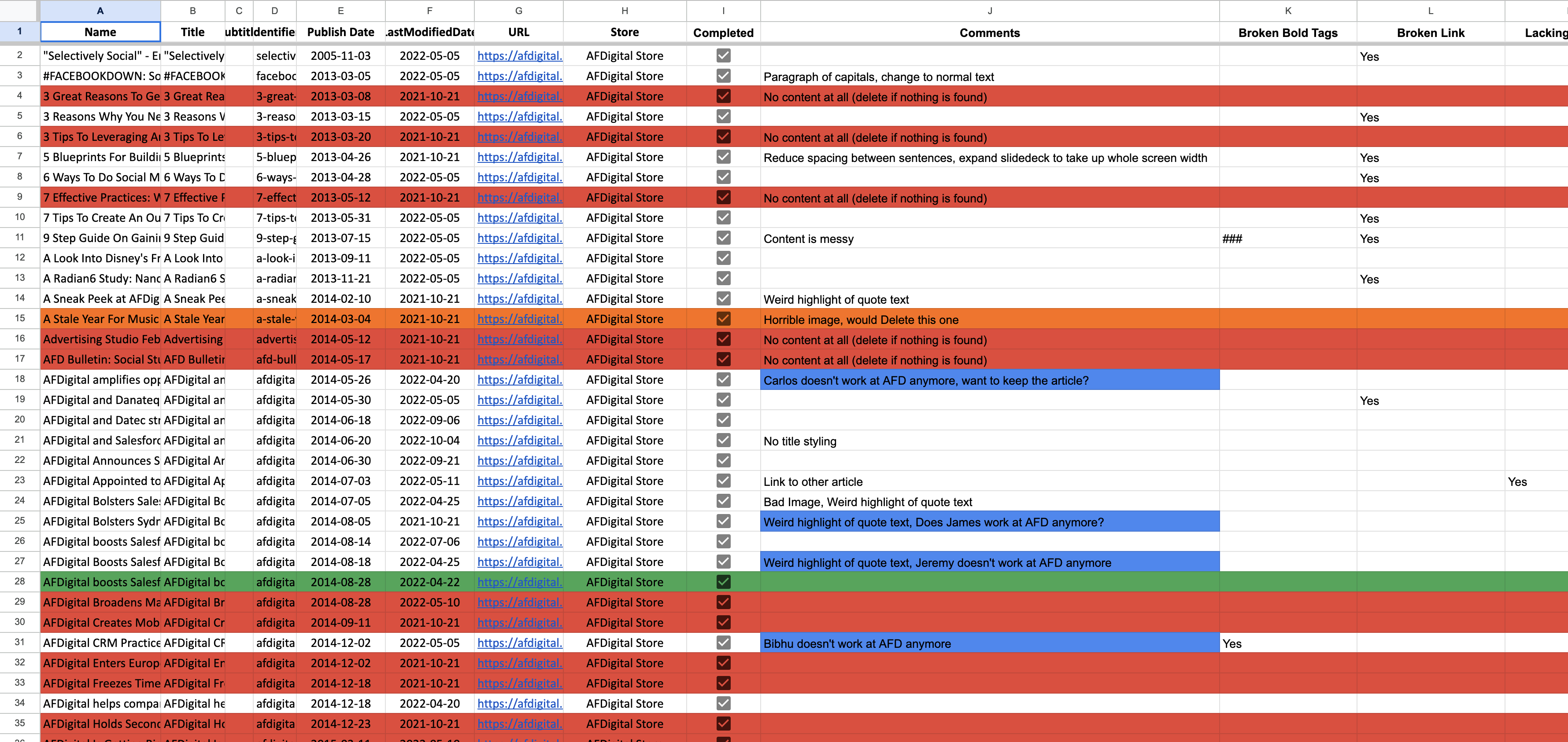
Screenshot of 'Article' content audit sheet
As a result of this audit the key takeaways were;
All “Case Studies” were duplicated and written as Success Stories in the ‘pages’ section of our website. In total there were 103.
In 'Articles', there were 62 articles that had no content on them beside the header image and title.
Based on my findings from the research phase as well as findings from the content audit, I was
confident that our website header needed a restructuring. The main goals for this phase were to;
increase user experience/engagement, make products easy to buy and
showcase that we are experts of industry.
The two key areas that were planned to be adjusted was the addition of an ‘Industry’ tab and
restructuring our case studies/articles section. Unfortunately, I had left the project before the
restructure of the case studies/articles section was set to be completed.
The ‘Industry’ landing pages were strategically designed to be high-converting landing pages to
attract new clients. The design and implementation of these pages are touched on later in this case
study.

AFDigital website header
To start building the website design, I made simple outlines (low-fidelity wireframes) for the main
content sections that will be used across the site.
These basic wireframes were crucial for early planning. They helped the team visualise how the site
will look and work. I focused on the most important parts like content order, interactions, and
navigation paths.
This early stage also allowed us to think about how the site will adapt to different devices and
screen sizes, ensuring a smooth user experience.
I also considered fundamental design principles like consistency and user flow. This step helped us
catch and fix potential issues early on, avoiding major changes later.
During this process, I encouraged collaboration and feedback from stakeholders, developers, and
marketing team members. Their insights were valuable in refining our initial design concepts,
ensuring they aligned with the project goals before moving on to more detailed designs.
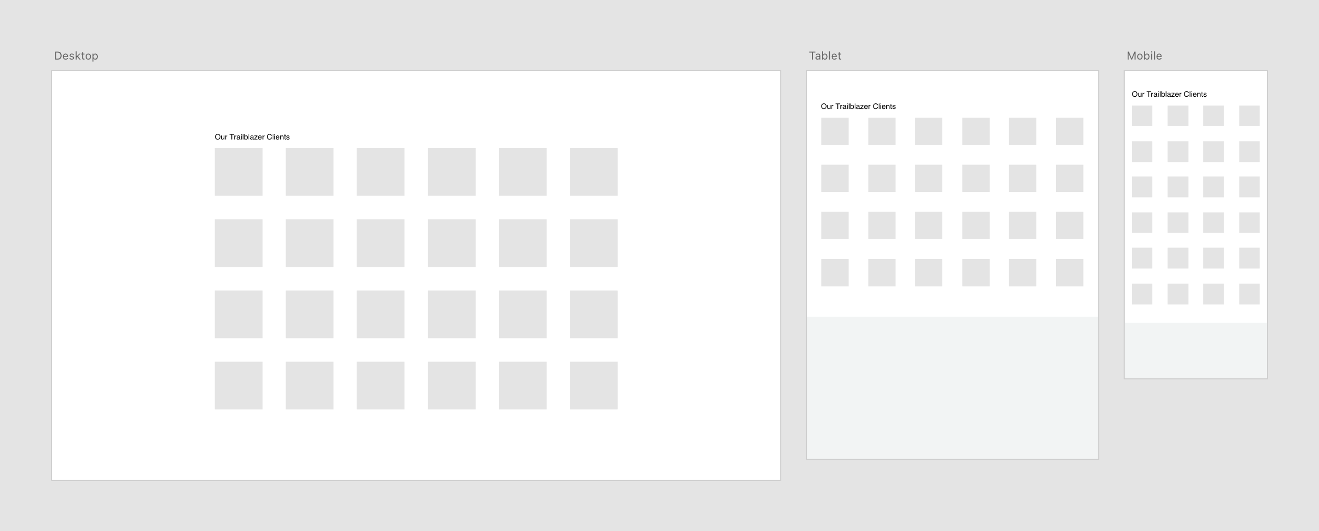
Screenshot of low-fidelity wireframes of client logo stack designed on Adobe XD
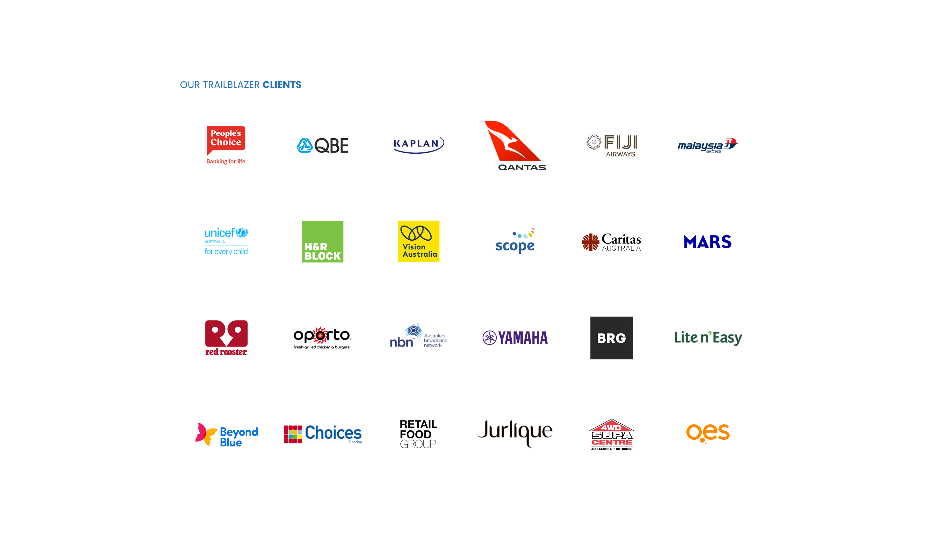
High-fidelity wireframe of client logo stack designed on Adobe XD
Building on the foundation laid by the low-fidelity wireframes, the transition to high-fidelity
design involved refining the visual details and adding a layer of polish to the user interface.
I created a detailed guide for how the new website should look from a UI perspective. I took
inspiration from the current website and our project research and collaborated with key stakeholders
to ensure my work still kept the branding style that the organisation was looking for.
During the high-fidelity phase, special attention is given to interactive elements and user
interfaces that demand a more nuanced design approach. This includes refining hover effects, button
states, and animations to create a more engaging and seamless user experience.
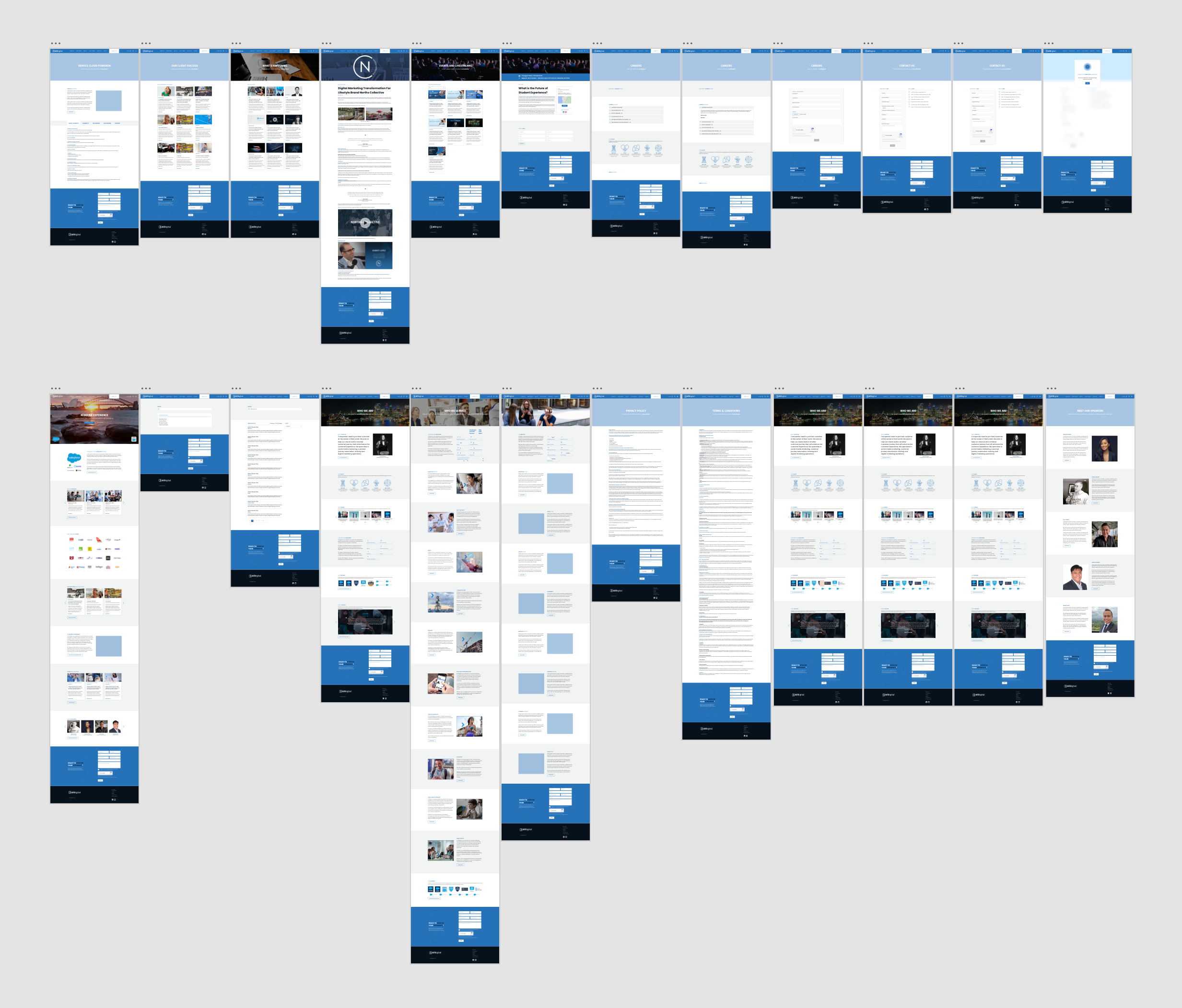
Screenshot of high-fidelity wireframes designed on Adobe XD
The high-fidelity designs are not just visually appealing but are also essential for finalising the collaboration with developers. I designed a series of handover wireframes that showcased important elements of the design including padding, font-sizes and colours.
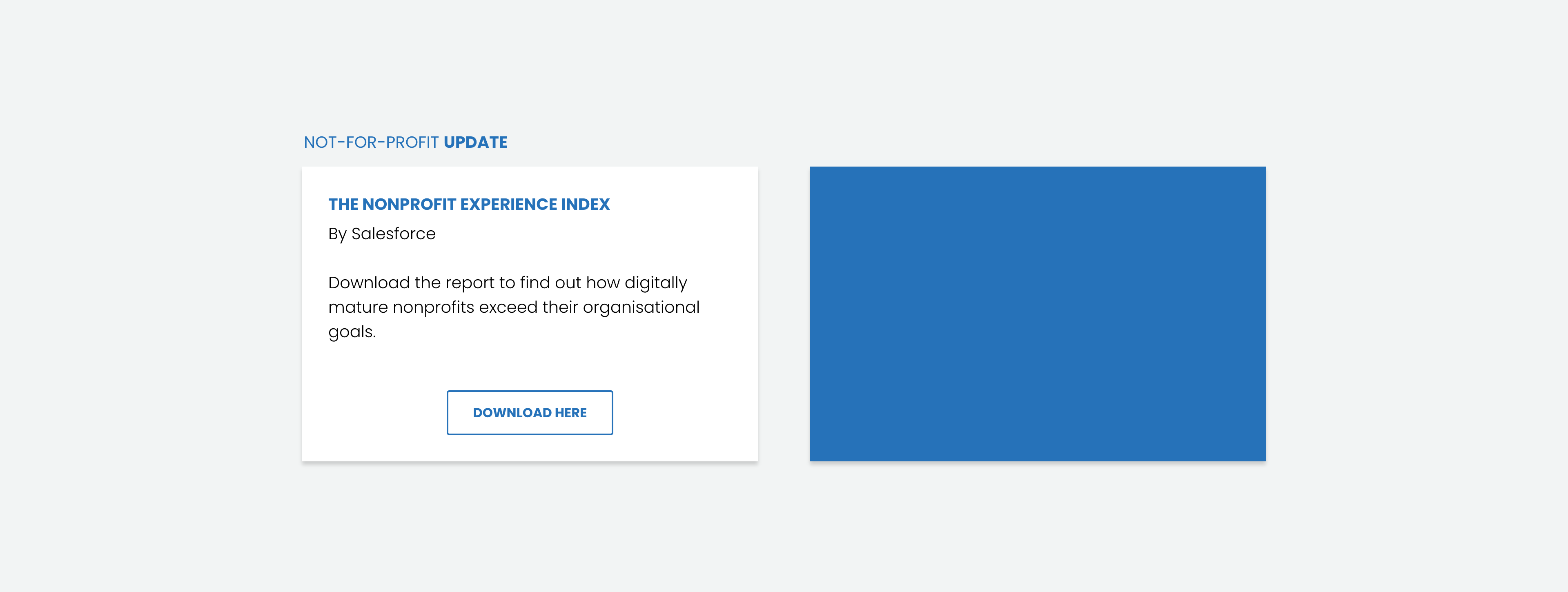
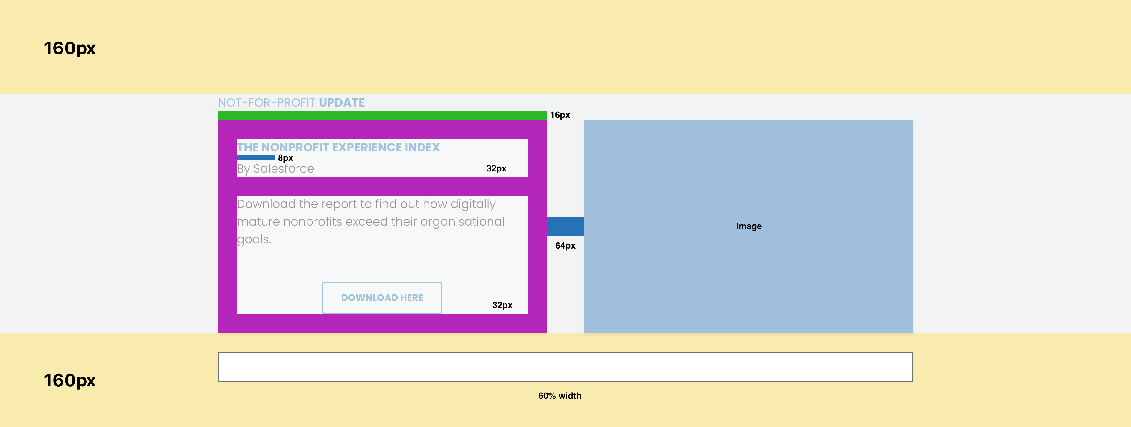
Example of content block ready for developer handover
During the development phase of this project, the primary focus was on creating 'Industry' landing pages, with my personal involvement in developing 11 of these pages. The structured process for this phase included:
Creating responsive templates for recurring content blocks on the landing pages
Incorporating copy and images onto the website
Publishing and configuring FormAssembly forms for contact submissions
To build the templates, we utilised Salesforce and StoreConnect. I started by creating the HTML and
CSS framework in Visual Studio Code, based on the high-fidelity wireframes. Subsequently, I
integrated the HTML into the template and added the CSS via BitBucket to our main CSS file. Each
section of the template was linked to a corresponding value in Salesforce, ensuring dynamic content
updates. For instance, the title of the content block was connected to the 'Title' value (refer to
the image below). This approach made adding copy and images to the website exceptionally easy and
time-efficient.
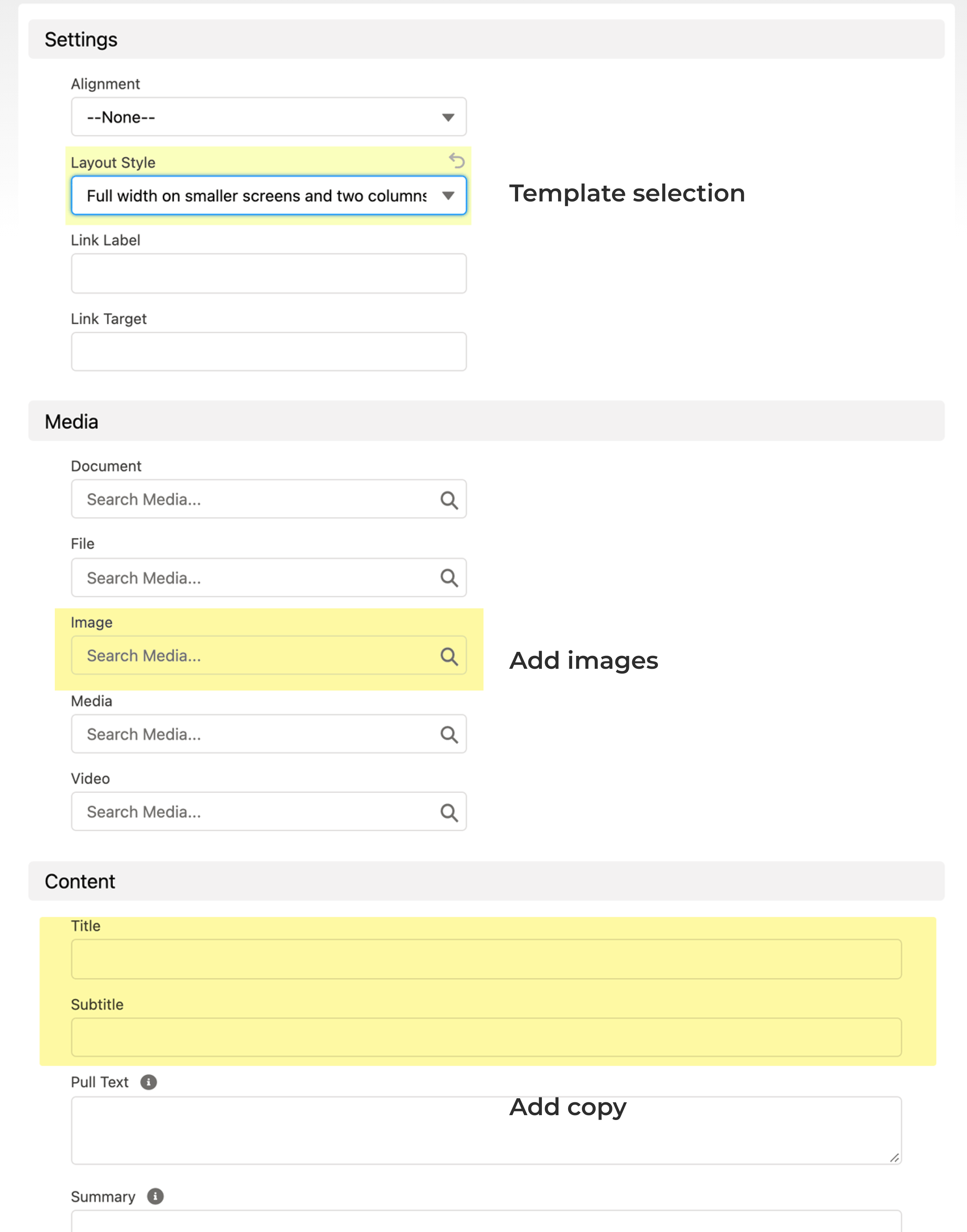
Example of adding copy/images onto a template through StoreConnect
Once all the content was in place, I collaborated with the development team to set up and publish a FormAssembly contact form, a crucial component for generating leads for the business. The strategic placement and functionality of these forms were carefully considered, optimising user interaction and ensuring a streamlined path for potential clients to connect with the business.
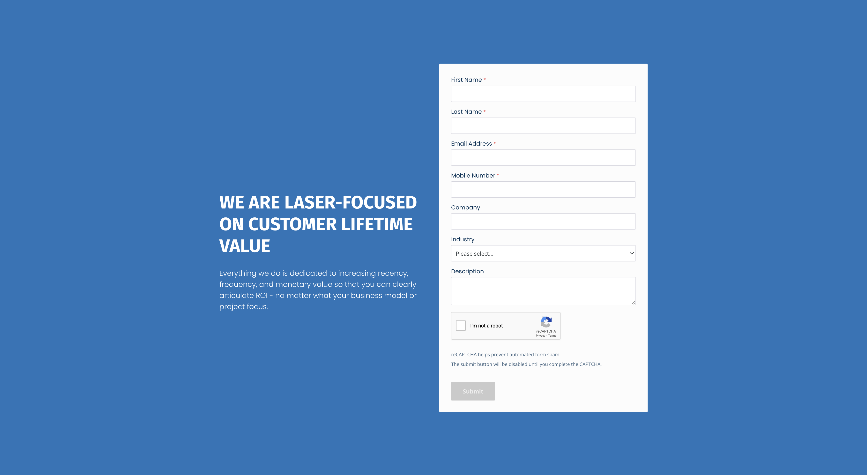
Contact form created with FormAssembly
At the completion of the project, I had designed a complete website redesign and personally developed a total of 15 industry and services pages.
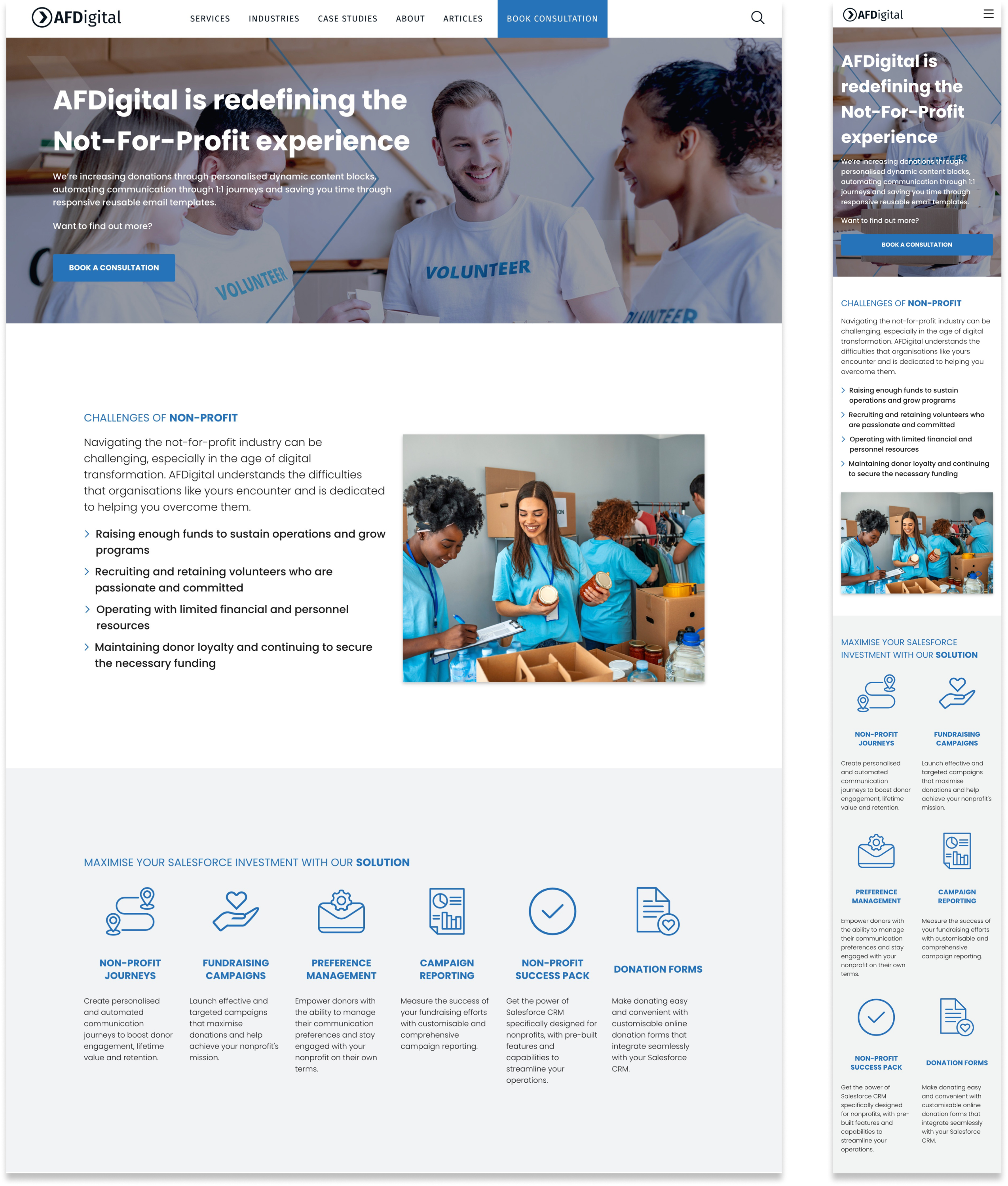
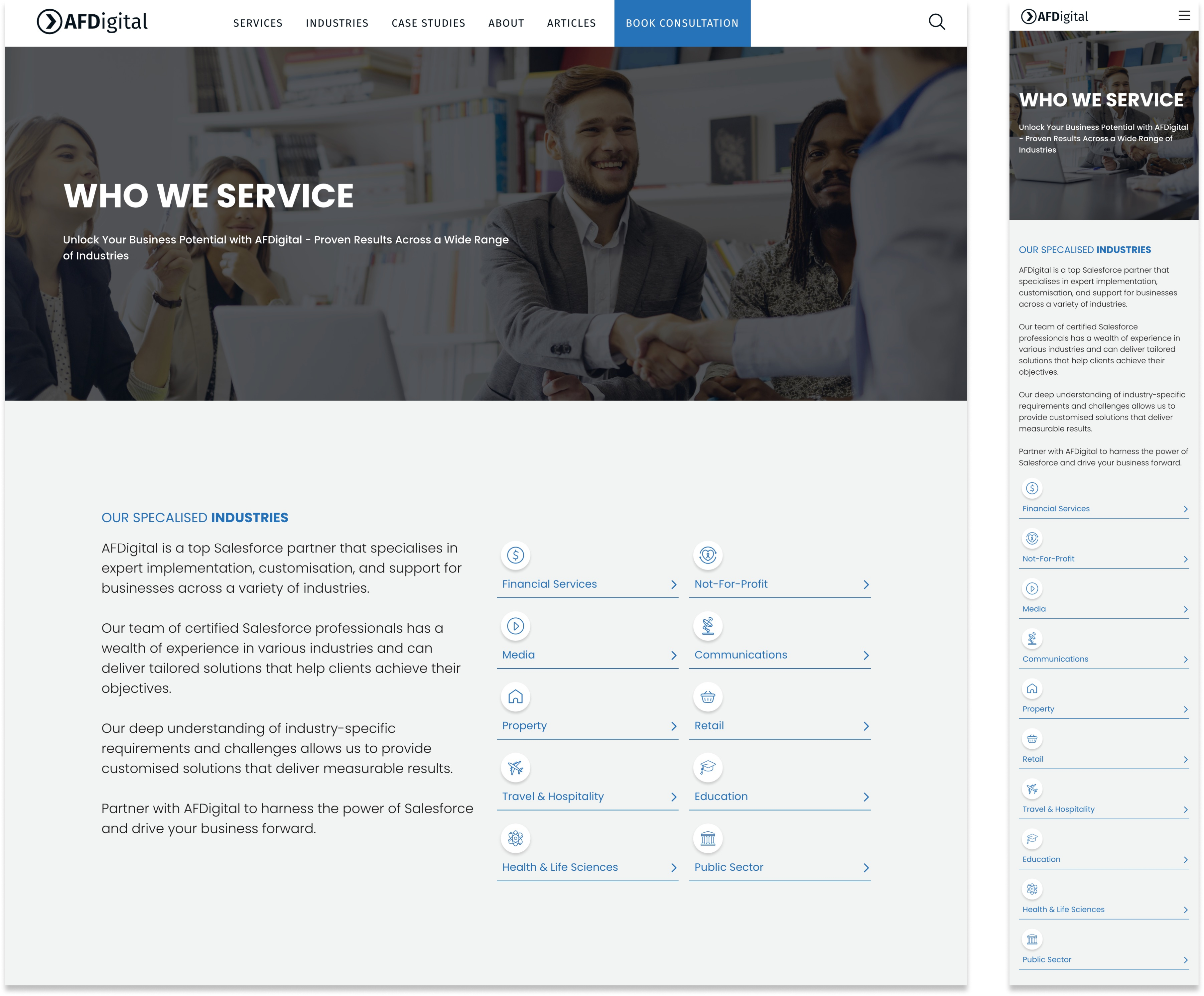
Unfortunately, three months after the completion of this project, the company underwent a rebrand, and as a result, the website and these pages are no longer active. However, their new website still maintains the same information layout as the ones I created.